1. This was a cover story about many Mexican immigrants’ accounts of their journey to America, some legal and some not. After reading through the copy of the story the editor provided, I came up with a couple pages of sketches. I based most of my concepts on actual tales told by the various immigrants. I always like to get the illustration dimensions as soon as possible so that I can base my ideas and sketches in the appropriate frame size. In this case, I went a step further and included the correct placement and size of the magazine’s title.
This was the second page of sketches and included the one that I eventually went with, #5.

2. After the editor chose #5, I made a larger, more detailed sketch for approval. It’s often an important step (if there’s time), not only to work out the idea for myself, but also to give the client a greater assurance of what they’re going to see. I usually don’t show the client any in-progress stuff, so in most cases this will be the last thing they see before I hand them the final.

3. This is the start of the final, at the correct size. I rough everything out first in order to nail down the composition. You can see the space I allotted up top for the magazine title and along the bottom for their headline footer.

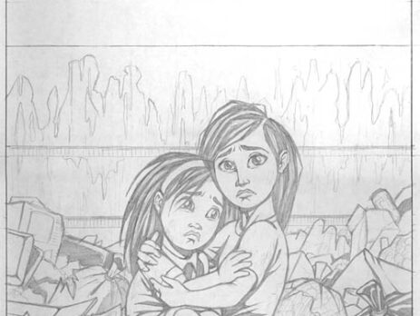
4. Next I go in and draw in all the details and work out exactly what’s going on in every part of the picture.

5. Often I like to go in and tighten up my pencils and lay out all the areas of solid black (which have become a large part of my style and technique, either because of this habit, or perhaps vice versa). Some artists’ inking style is very loose, fluid, and organic. I’ve always been more comfortable making my inks as tight and structured as possible. Therefore, I like to basically decide as much of it ahead of time in the pencil stage so as to leave as few surprises as possible later on.

6. The finished inks. I typically don’t put all that much texture into my images, except when I deem it necessary. In this case, a dumpster full of garbage seemed to demand a certain degree of texture and linework. It’s people that I don’t like to texture, unless I want them to appear dirty or worn. And since everything else in the image is detailed, it made sense to leave the two girls be so that they stood out more against the refuse they are hiding in.

7. After xeroxing the inked page, I go in with marker and color the drawing. I usually consider the marker step to be a preliminary stage of color, as I almost always mess with them in Photoshop. The markers don’t always capture the right shade or tone that I am after, so thank heavens for the digital medium.

8. This is the Photoshopped image, where I think the *mood* of the illustration takes its true form. In this case I made several tweaks to create the image that I wanted. Obviously, I added the color of the sky with the gradient tool. The hue of the overall image colors has been knocked back, mixed with brown for effect. The surrounding garbage and dumpster were darkened to create a more foreboding mood and to focus more attention on the girls. I added a slight outer glow around the girls just to bring them out from their surroundings a tiny bit more.
I really like the extra space up top, even though it was intentionally left for the magazine title. I’ve always felt that way towards cover illustrations; something about that empty space (typically up top) has always been dramatic and interesting to me. It creates a certain stillness, a fascinating empty and ponderous calm void wherein the drama and story of the image hangs frozen. Admiring the work of illustrators and the way a story can be encapsulated in a single image has shaped the way I approach my art, regardless of whether the piece is for a magazine/book or not.

9. The final stage of the process is one that is out of my control – final layout by the designer/art director/editor/whoever. I’m not in love with some of the typographic/font choices, but I do like the way the magazine logo was overlaid onto the sunset. And the way the word “free” from their masthead is placed on the illustration is clever and thematically significant.
