There’s a somewhat long and slightly interesting story behind this image. Interesting if you’re me, that is.
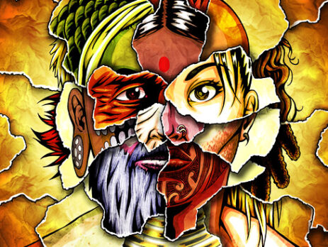
 It is a redo of an illustration I had done years prior for a magazine I was the art director of, 78 Magazine. The original image was a black-and-white graphite drawing for the cover of an issue that focused on skin (dubbed “The Skin Issue”) and its importance in culture, medicine, etc.
At the time I was merely an illustrator for the publication, and the editorial staff came up with the concept of a person made up of a patchwork of torn paper, each showcasing different skin colors, cultures, races, ethnicities, etc. However, they had no idea how they would accomplish such an image as a photo-montage or photo-illustration until I humbly suggested, “How ’bout I just draw it?”
The original was done in graphite on illustration board in a realistic style. The off-center composition was done to allow the magazine title and headlines to stretch across the left side. I always liked the image and concept, but was unable to use it in my portfolio or promotions because its style clashed with the way I work now.
Years later I decided to redo the drawing in my current style. I also relished the opportunity to revisit the piece so that I could correct the mistakes I had noticed over the years and apply all the lessons I had learned since. A chance to change the past and fix mistakes of inexperience! I’m still figuring out how to do that with girls.
One of the things I wanted to improve upon was the arrangement of the paper shreds. I wanted them to have a more focused and lucid composition, so I spent many sketches working out their radial layout which I thought would help further draw the viewer into the piece (its literal center as well as its meaning). Overall, I kept much of the details concerning the arrangements of the races and such the same since I thought the original worked out pretty well. This time around I included a portion of a Maori’s tattooed face which I always thought looked awesome.
Since the image was in color this time, I was able to fully explore the concept’s potential (and then some). I mostly abandoned realism and really exaggerated the colors of each individual shred to create as vibrant and visually interesting look as possible. The texture of the background was of a wrinkled piece of paper, scanned and overlaid many times.
This was definitely the most intensive and extensive Photoshopping I had done on an image. The file is over 500 megabytes and contains more than 40 layers and more than 20 channels. I think it paid off.


