1. Initial pencil sketch. “Phoebius” was a more experimental project for me in both subject matter and visual style. It took a couple sketches to work out the composition and her pose. I also wanted to see how my unique concept of shading and form would work out visually.
2. Completed full size pencil drawing. I did a pencil drawing at the intended size of the digital drawing (20 x 26″). Although this was by no means my first digital piece, it was the largest I had done to date. I like to sketch with two pencils of differing lead hardness/darkness – initially with the lighter, and then with the darker when it comes time to tighten the lines up.
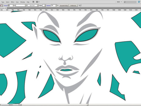
3. Beginning digital drawing. Here’s an early screenshot of the drawing being traced over in Adobe Illustrator. I had the scanned pencils on a lower layer that I would toggle on and off to see how the digital layer was turning out. I follow a very similar procedure to a traditional drawing -Â “inking” the blacks first and then moving on to the color/shaded areas. Because of the negative space usage of the image, I actually drew the background shapes in, not the form of the medusa herself.
4. Completed Illustrator drawing. Once all the basic forms and shading were all drawn out in Illustrator, it was time to bring it into Photoshop for some additional coloring and effects.
5. Background painting. I actually busted out my brushes and spent some money on a few paint colors (many of the ones leftover from college having dried up), but I ultimately ended up creating a background painted texture from scratch in Photoshop.
6. Completed image. The background image was composited in Photoshop, where I also applied several subtle shading and texture effects to the form of the Medusa. IÂ strove for a stark and minimal appearance with this piece, so I reigned in any tendencies to overwork it. I wanted the dominant color to be white, complimented by a simple but textured aqua backdrop. A subtle violet hue was given to the gray shaded areas to accent the green. The white border is an intentional component of the piece that frames the white negative space, which is actually inverted to be the positive space of the figure. Fin.


